
In a digital-first economy, website accessibility is a business imperative, not a compliance afterthought. An inaccessible website excludes a significant portion of the global population and exposes your organization to legal risk under the Americans with Disabilities Act (ADA). Viewing accessibility as a mere task, however, misses a crucial opportunity. A truly accessible website enhances user experience for everyone, improves SEO performance, strengthens brand reputation, and expands your market reach. This comprehensive ada compliance website checklist provides actionable steps and expert insights drawn from our experience building compliant, high-performance digital solutions for SaaS, fintech, and enterprise clients.
This guide breaks down the critical technical and strategic components required for genuine digital inclusivity, mapping each checkpoint directly to the Web Content Accessibility Guidelines (WCAG)—the globally recognized standard for web accessibility. More importantly, we demonstrate how to integrate these practices into your existing development lifecycle for sustainable, long-term success.
This checklist is your definitive roadmap to not only meet legal standards but also to build a more inclusive, effective, and profitable digital presence. By following these steps, you will learn to identify and remediate common accessibility barriers, from missing alt text to complex navigation and form errors. The result is a digital experience that serves all users, mitigates risk, and unlocks new avenues for business growth.
1. Alt Text for Images and Visual Content
Providing descriptive alternative (alt) text for all non-decorative images and visual elements is a foundational step in any ADA compliance website checklist. This simple HTML attribute ensures that users who rely on screen readers can understand the content and context of images they cannot see. It's a critical component of digital accessibility, directly addressing WCAG 2.1 Success Criterion 1.1.1 Non-text Content (Level A). Without it, visual information becomes a significant barrier, excluding users with visual impairments from fully engaging with your site.

Effective alt text is an art of being concise yet descriptive. The goal is to convey the same information or function as the image. For instance, government websites following Section 508 standards, like GSA.gov, rigorously implement alt text to ensure all citizens have equal access to information. Similarly, financial institutions like Bank of America use detailed alt text for product screenshots, enabling all users to understand their digital banking tools.
How to Implement Effective Alt Text
Writing meaningful alt text requires understanding the image's purpose within the page's context.
- Be Descriptive and Concise: Keep the description under 125 characters if possible. Instead of
alt="chart", usealt="Bar chart showing a 25% increase in Q3 revenue compared to Q2." - Avoid Redundancy: Screen readers announce an element as an "image," so phrases like "image of" or "picture of" are unnecessary.
- Context is Key: If an image of a golden retriever is on a veterinarian's homepage,
alt="Healthy golden retriever running on a beach"is appropriate. If it's on a product page for a dog collar,alt="Golden retriever wearing our red waterproof collar on the beach"is better. - Mark Decorative Images: For images that are purely for aesthetic purposes and convey no information, use a null alt attribute (
alt=""). This tells screen readers to ignore the image, preventing unnecessary noise.
By prioritizing high-quality alt text, you improve usability for assistive technology users and enhance your site's SEO, as search engines use this text to understand and index your visual content. You can learn more about the fundamentals of making web content accessible on group107.com and its impact on user experience.
2. Keyboard Navigation and Focus Management
Ensuring that all website functionality is accessible via a keyboard alone is a cornerstone of any effective ADA compliance website checklist. This principle mandates that users can navigate, interact with, and access all content without relying on a mouse. It is a fundamental requirement for users with motor disabilities who may not be able to use a mouse, as well as for screen reader users who primarily navigate with keyboard commands. This directly addresses WCAG 2.1 Success Criterion 2.1.1 Keyboard (Level A), a critical requirement that makes digital experiences possible for a significant portion of the population.
For example, e-commerce giants like Amazon and payment platforms like PayPal have invested heavily in ensuring their complex user flows, from browsing to checkout, are fully keyboard-operable. This allows all users to complete transactions successfully. Similarly, developer-focused platforms like GitHub excel by providing extensive keyboard shortcuts, allowing power users to navigate repositories and manage projects with maximum efficiency. These real-world examples show that robust keyboard support is not just a compliance checkbox but a feature that enhances usability for everyone.
How to Implement Effective Keyboard Navigation
Proper implementation requires a focus on semantic HTML, visible focus states, and logical content order.
- Prioritize Semantic HTML: Use native interactive elements like
<button>,<a>, and<input>whenever possible. These elements have built-in keyboard accessibility, whereas a<div>with a click event handler does not, requiring extra work to make it accessible. - Ensure Visible Focus: Users must be able to see which element is currently active. Implement a clear and consistent focus indicator using CSS, such as
a:focus { outline: 3px solid #005fcc; }. This visual cue is essential for sighted keyboard users. - Test Your Tab Order: Navigate your site using only the Tab (forward), Shift+Tab (backward), Enter, and Space keys. The focus should move through interactive elements in a logical, predictable sequence that follows the visual layout.
- Implement "Skip Navigation" Links: For pages with extensive navigation menus, provide a "skip to main content" link as the first focusable element. This allows keyboard users to bypass repetitive navigation and get directly to the page's primary content.
By focusing on these key areas, you build a foundation that is not only compliant but also more intuitive and efficient for all users. Dive deeper into the specifics of keyboard accessibility and other web accessibility best practices on group107.com to ensure your digital products are truly inclusive.
3. Color Contrast Compliance (Text and Interactive Elements)
Ensuring sufficient color contrast between text and its background is a non-negotiable part of any ADA compliance website checklist. This practice guarantees that content is readable for users with low vision, color blindness, or other visual impairments. It directly addresses WCAG 2.1 Success Criterion 1.4.3 Contrast (Minimum), a Level AA requirement. Without adequate contrast, your text, icons, and interactive elements can become difficult or impossible to perceive, creating a significant barrier to access and usability.
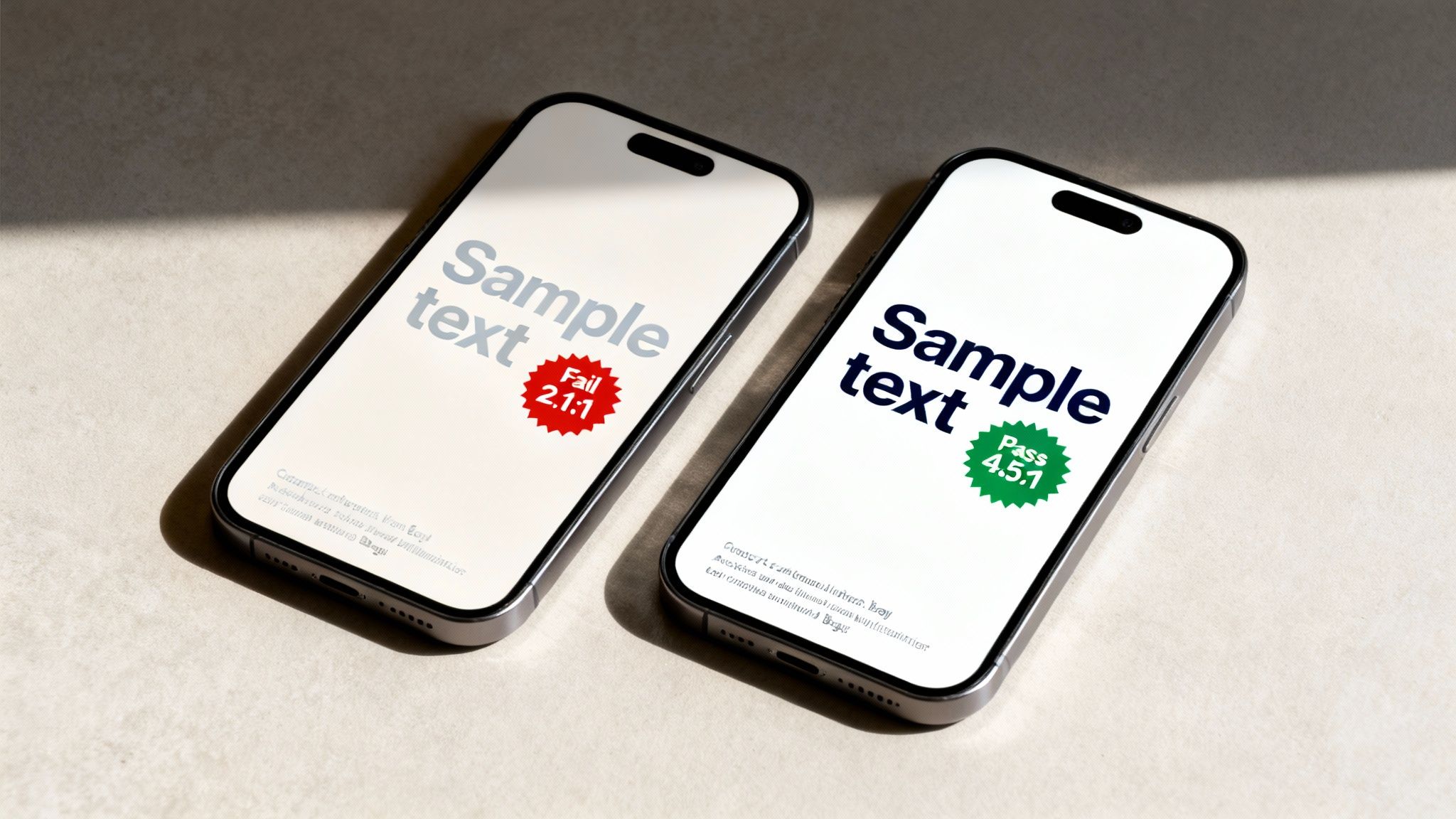
Leading organizations understand that readability is fundamental to user experience. The accessibility guidelines from the W3C set clear, internationally recognized standards for contrast. Tech giants like Microsoft build their product suites, including Office and Windows, with these contrast minimums baked into the user interface. Similarly, major banking portals such as Chase and Wells Fargo often provide high-contrast themes, allowing users to select a display mode that best meets their visual needs.
How to Implement and Verify Color Contrast
Achieving contrast compliance requires a proactive approach, integrating checks throughout your design and development workflow. The WCAG standards provide clear, measurable ratios to follow.
- Meet Minimum Ratios: The standard contrast ratio is 4.5:1 for normal text. For large text (18pt/24px or 14pt/19px bold), the minimum ratio is 3:1. UI components and graphical objects must also meet a 3:1 ratio.
- Use Contrast Checking Tools: Integrate tools like the WebAIM Contrast Checker or browser developer tools into your design process. This allows you to validate your color palette before development even begins.
- Don't Rely on Color Alone: Never use color as the only means of conveying information, such as indicating a required field with red text. Supplement color cues with icons, patterns, or explicit text labels.
- Test on Real Backgrounds: A color combination that passes on a solid background might fail when placed over a gradient or image. Always test text in its final, intended context to ensure it remains legible.
- Offer High-Contrast Modes: For complex interfaces, providing a user-selectable high-contrast mode is an excellent way to support users with diverse visual requirements, going beyond the minimum compliance levels.
4. Semantic HTML and Proper Heading Structure
Using semantic HTML elements and a logical heading hierarchy is a cornerstone of any effective ADA compliance website checklist. This practice provides a clear, predictable structure that assistive technologies, particularly screen readers, rely on to interpret and navigate web content. It directly addresses WCAG 2.1 Success Criterion 1.3.1 Info and Relationships (Level A), a fundamental requirement that ensures all users can understand the page's organization and the relationships between its different parts. Without a logical structure, a webpage is like a book with no chapter titles, making it incredibly difficult for users with disabilities to find information efficiently.
Proper structure turns a flat wall of text and elements into a navigable outline. For example, BBC News employs a strict heading hierarchy on its article pages, allowing screen reader users to jump from the main headline (H1) to key section headers (H2s and H3s) to quickly grasp the story's key points. Likewise, the MDN Web Docs by Mozilla serves as a gold standard, using elements like <header>, <nav>, <main>, and <footer> to define page regions, creating a seamless navigation experience for everyone.
How to Implement Semantic HTML and Headings
Building a logical document outline requires using HTML elements for their meaning, not just their appearance. This foundational step is crucial for both accessibility and SEO.
- Use One
<h1>Per Page: The<h1>tag should represent the main title or topic of the page. Using more than one can confuse both screen readers and search engines about the page's primary purpose. - Never Skip Heading Levels: The heading structure must follow a logical order. Always descend from
<h1>to<h2>, then<h3>, and so on, without jumping levels (e.g., from an<h2>directly to an<h4>). This maintains a coherent outline. - Structure, Not Style: Use headings to create a logical hierarchy for your content, not for visual styling. If you need to change the appearance of text, use CSS classes instead of an inappropriate heading level.
- Validate Your Structure: Use tools like the WAVE Web Accessibility Evaluation Tool or an HTML Validator to check for heading errors and ensure your semantic markup (
<nav>,<main>,<article>, etc.) is used correctly. You can learn more about building a strong foundation for your site by reviewing how to make a website accessible from the ground up on group107.com.
5. Form Labels and Input Association
Ensuring all form fields have clearly associated labels is a fundamental requirement in any ADA compliance website checklist. This practice involves programmatically linking a descriptive text label to its corresponding input field, such as a text box, checkbox, or radio button. This connection is vital for users of assistive technologies like screen readers, which announce the label when the user focuses on an input, explaining what information is required. This directly addresses WCAG 2.1 Success Criteria 1.3.1 (Info and Relationships) and 3.3.2 (Labels or Instructions), both Level A requirements.
Properly labeled forms are the bedrock of accessible online interactions. For example, financial platforms like PayPal and Stripe rely on perfectly associated labels for their checkout and payment forms, ensuring transactions are seamless and error-free for all users. Similarly, government portals like the IRS or Social Security Administration use explicit labeling to guide citizens through complex data entry tasks, making critical services accessible. Without these programmatic links, forms become confusing and unusable barriers.
How to Implement Accessible Form Labels
Effective implementation goes beyond just placing text next to a field; it requires a direct programmatic connection.
- Use the
<label for="">Attribute: The most robust method is to use the<label>element with aforattribute that matches theidof the corresponding<input>element. For example:<label for="fname">First Name</label><input type="text" id="fname">. - Group Related Inputs: For groups of related controls like radio buttons or checkboxes, use a
<fieldset>to contain them and a<legend>to provide an overall group label. This gives context to screen reader users, such as "Choose a delivery option." - Never Use Placeholders as Labels: Placeholder text disappears once a user starts typing and is often skipped by assistive technology. It should only be used for supplemental hints, not as the primary label.
- Connect Errors to Inputs: When a validation error occurs, programmatically associate the error message with the input field using the
aria-describedbyattribute. This ensures screen readers announce the error when the user returns to the invalid field. - Clearly Mark Required Fields: Use a visual indicator (like an asterisk) and the
aria-required="true"attribute on the input element to signify that a field is mandatory for both visual and non-visual users.
By correctly labeling all form inputs, you significantly enhance usability for everyone, not just users with disabilities. This practice reduces cognitive load, minimizes errors, and creates a more inclusive and efficient user experience, a core principle of digital product development.
6. Page Title and Purpose Identification
Ensuring every webpage has a unique and descriptive title is a fundamental requirement in any ADA compliance website checklist. The HTML <title> tag provides a concise summary of the page's purpose, which is typically the first piece of information announced by screen readers when a user lands on a new page. This immediate context is crucial for users with visual impairments, allowing them to orient themselves and confirm they have navigated to the correct location. This practice directly fulfills WCAG 2.1 Success Criterion 2.4.2 Page Titled (Level A), which prevents disorientation and improves site usability for everyone.
A well-crafted page title helps users understand where they are without having to parse the entire page content. For example, a financial institution like PayPal uses clear, structured titles such as "Account Settings – Transfer Funds | PayPal," immediately informing the user of both the specific task and the general section. Similarly, developer platforms like GitHub use titles like "Create New Project – GitHub" to clearly state the page's function. In contrast, generic titles like "Untitled Document" or "Home Page" create significant accessibility barriers.
How to Implement Effective Page Titles
Writing effective page titles involves putting the most important, page-specific information first, followed by broader site context. This front-loading approach ensures screen reader users hear the most relevant details immediately.
- Follow a Clear Format: A proven format is
Primary Page Content - Section | Brand Name. This structure prioritizes the specific page function. - Be Unique and Descriptive: Each page title must be unique to avoid confusion. Audit your site with a crawler to find and fix duplicate or missing titles.
- Place Specific Info First: The most unique aspect of the page should come first. For an e-commerce product page, this would be the product name.
- Keep It Concise: Aim for titles under 60 characters to ensure they are fully visible in browser tabs and search engine results, which benefits all users.
- Update Titles in Single-Page Applications (SPAs): For applications built with frameworks like React or Vue, use JavaScript to dynamically update the document title as the user navigates between different views or states.
By creating descriptive and unique page titles, you not only meet a core accessibility requirement but also improve the overall user experience and enhance your site’s SEO. This small but critical detail is a cornerstone of an inclusive and easily navigable digital presence.
7. Language Declaration and Text Direction
Properly declaring the primary language of a web page and the direction of its text is a fundamental requirement in any ADA compliance website checklist. The HTML lang attribute informs assistive technologies, like screen readers, which language pronunciation rules to apply, ensuring that content is spoken correctly. This directly addresses WCAG 2.1 Success Criterion 3.1.1 Language of Page (Level A), making it an essential, non-negotiable step for global accessibility.
Without a correct language declaration, a screen reader might attempt to read English text with French pronunciation rules, or vice-versa, rendering the content incomprehensible. This creates a significant barrier for users with visual impairments or cognitive disabilities who rely on text-to-speech software. For multinational organizations, this is not just a compliance issue but a core usability requirement for serving a diverse audience. Platforms like Duolingo and Google Translate master this by dynamically setting language attributes to provide a seamless multilingual user experience.
How to Implement Language and Direction Correctly
Implementing language attributes is straightforward but requires attention to detail, especially for sites with multilingual content.
- Declare the Primary Language: Always set the
langattribute on the root<html>element to define the default language for the entire page. For example:<html lang="en-US">. - Specify Language Regions: Use specific language subtags when necessary to account for regional dialects, such as
en-GBfor British English ores-MXfor Mexican Spanish. - Mark Language Changes: If a section of text differs from the primary page language, wrap that content in an element with its own
langattribute. For instance:<p>He said, <span lang="fr">"C'est la vie."</span></p>. - Handle Text Direction: For languages written right-to-left (RTL), like Arabic or Hebrew, use the
dir="rtl"attribute alongside thelangattribute. For example:<div lang="ar" dir="rtl">النص العربي</div>. - Validate Language Codes: Ensure all language codes used on your site conform to the ISO 639-1 standard to guarantee they are recognized by browsers and assistive technologies.
Beyond strict ADA compliance, expanding content reach to diverse linguistic groups is another facet of accessibility, as exemplified by initiatives like Amazon's AI-powered multilingual accessibility for Kindle books. Correctly declaring language is the technical foundation that makes such inclusive digital experiences possible.
8. Error Identification and Recovery
Ensuring users can identify and correct errors when filling out forms is a non-negotiable part of any ADA compliance website checklist. When an error occurs, the system must clearly describe the problem and its location to all users, including those who rely on screen readers. This is fundamental to a usable digital experience, directly addressing WCAG 2.1 Success Criterion 3.3.1 Error Identification (Level A). Without clear error handling, forms become insurmountable obstacles, preventing users with disabilities from completing critical tasks like making a purchase or signing up for a service.

Effective error recovery is a hallmark of well-designed, inclusive platforms. Payment processors like Stripe provide excellent examples by displaying inline error messages that specify exactly what is wrong, such as an invalid credit card number. Government sites, which must adhere to strict accessibility standards, often highlight required fields and provide real-time validation feedback. Similarly, secure banking applications guide users with clear password strength indicators and specific error messages, ensuring they can successfully manage their accounts.
How to Implement Accessible Error Handling
Properly implementing error messages involves programmatic association and clear communication to guide the user toward a solution.
- Provide Specific, Text-Based Messages: Instead of just highlighting a field in red, provide a clear text message. Avoid vague messages like "Invalid input." Use descriptive text like, "Error: The email address you entered is not valid."
- Programmatically Link Errors to Fields: Use the
aria-describedbyattribute to create a programmatic link between the error message and its corresponding form field. This ensures screen readers announce the error when the user focuses on the field. - Announce Errors Dynamically: Use an ARIA live region (
aria-live="assertive") for a summary of errors at the top of the form. This immediately notifies screen reader users that an issue occurred upon submission, preventing confusion. - Suggest Corrections: Whenever possible, offer helpful suggestions to fix the error. For an invalid email entry, a message like, "Did you mean john.doe@example.com?" can significantly improve the user experience.
- Manage Focus: After a submission error, programmatically move the user's focus either to the overall error summary or to the first form field containing an error. This directs their attention to the problem area.
9. Video and Audio Content Captions and Transcripts
Making video and audio content accessible is a non-negotiable part of any modern ADA compliance website checklist. By providing synchronized captions for videos and full transcripts for all multimedia, you ensure that users who are deaf or hard of hearing can access the information. This directly addresses WCAG 2.1 Success Criterion 1.2.2 Captions (Prerecorded) at Level A and 1.2.4 Captions (Live) at Level AA, making it a fundamental requirement for inclusive digital experiences. Without these accommodations, your valuable multimedia content becomes an insurmountable barrier for a significant portion of your audience.
Media giants like Netflix and YouTube have set the standard, providing robust captioning and, in some cases, audio descriptions for their vast libraries. Educational platforms such as TED Talks go a step further by offering full, interactive transcripts alongside every video, allowing users to read along or search for specific content. This practice not only serves users with hearing impairments but also benefits those in sound-sensitive environments or non-native speakers who find text easier to follow.
How to Implement Effective Captions and Transcripts
Proper implementation goes beyond simply converting speech to text; it involves capturing the full auditory experience.
- Ensure Synchronization and Accuracy: Captions must appear in real-time with the spoken words. For pre-recorded content, use services like Rev.com or 3Play Media for professional accuracy, or create your own using the widely supported WebVTT format.
- Include Non-Speech Information: Effective captions describe important non-speech audio cues that contribute to the context, such as
[upbeat music playing],[door slams], or[audience laughter]. Also, identify different speakers, for instance,[Maria]: We need to update the servers. - Provide Full Transcripts: A transcript is a complete text version of the audio content. Link to it directly below the media player or offer it as a downloadable file. This is crucial for users who rely on braille displays and for anyone who prefers to read the content.
- Plan for Live Content: For live events like webinars or broadcasts, you must use a real-time captioning service, often called Communication Access Realtime Translation (CART), to provide live, synchronized captions.
By embedding captions and transcripts into your multimedia strategy, you not only achieve critical compliance but also improve user engagement and SEO. Search engines can crawl and index the text in your transcripts, making your video and audio content discoverable through text-based searches.
10. Accessible Data Tables and Complex Content Structures
Ensuring data tables are properly structured with semantic HTML is a non-negotiable part of any ADA compliance website checklist. When tables are built using <div> elements or lack proper markup, screen reader users cannot navigate them effectively, turning valuable data into an incomprehensible jumble. This directly addresses WCAG 2.1 Success Criterion 1.3.1 Info and Relationships (Level A), a fundamental requirement that mandates information and structure conveyed visually must also be available programmatically.
Properly coded tables allow assistive technologies to identify headers and associate them with corresponding data cells, enabling users to understand relationships between data points. Financial sites like Yahoo Finance use semantic <th> (table header) tags with scope attributes to define row and column headers in stock market tables. Similarly, government portals like the Census Bureau use the <caption> element to provide a clear, accessible title for their complex statistical data tables, ensuring all users can grasp the table's purpose upfront.
How to Implement Accessible Data Tables
Building an accessible table requires using native HTML table elements and associating headers with data cells correctly.
- Use Semantic HTML: Always use
<table>,<thead>,<tbody>,<th>,<td>, and<caption>elements. Never create a table-like layout using CSS and<div>tags, as this breaks the structure for screen readers. - Provide a Caption: Include a descriptive
<caption>element as the first child of the<table>. For example:<caption>Quarterly Sales Performance by Region for Q3 2024</caption>. - Associate Headers and Data: For simple tables, use the
scopeattribute on header cells (<th scope="col">for column headers,<th scope="row">for row headers). This explicitly tells assistive tech what data the header applies to. - Handle Complex Tables: For tables with multiple levels of headers, use the
idandheadersattributes. Assign a uniqueidto each header cell (<th id="q3">) and reference the relevant IDs in theheadersattribute of the data cell (<td headers="region1 q3">). - Ensure Responsive Behavior: On smaller screens, avoid hiding columns. Instead, use a horizontal scroll container or reflow the table content into a card-style layout to maintain access to all data.
By implementing these techniques, you ensure that complex data is not a barrier but a resource for all users. You can explore more about creating inclusive digital products by understanding the core tenets of universal design on group107.com.
10-Point ADA Website Accessibility Comparison
| Accessibility Feature | Implementation Complexity | Resource Requirements | Expected Outcomes | Ideal Use Cases | Key Advantages |
|---|---|---|---|---|---|
| Alt Text for Images and Visual Content | Low to Medium | Editorial time, CMS updates, QA | Improved accessibility, SEO, compliance | Images, icons, user-generated content | Low cost, high ROI, minimal performance impact |
| Keyboard Navigation and Focus Management | Medium | Developer time, manual testing, focus management | Full keyboard operability, better usability | SPAs, interactive apps, complex forms | Enables motor-impaired users, improves efficiency |
| Color Contrast Compliance (Text & UI) | Low to Medium | Design updates, contrast testing tools, palette changes | Readable UI, measurable WCAG compliance | Text-heavy interfaces, dashboards, branding | Objective standard, automated testing available |
| Semantic HTML and Proper Heading Structure | Low | Developer training, code reviews | Improved screen reader navigation and SEO | Content sites, documentation, blogs | Foundational, easier maintenance, SEO benefit |
| Form Labels and Input Association | Low | Dev discipline, design coordination, QA | Higher form completion rates, accessible forms | Payment forms, signups, surveys | Essential for form usability and conversions |
| Page Title and Purpose Identification | Very Low | Minimal dev change, SPA title handling | Better orientation, SEO, simple compliance | All pages, SPAs with dynamic routes | Quick win, negligible cost |
| Language Declaration and Text Direction | Very Low | Minor markup, i18n coordination | Correct pronunciation, better localization support | Multilingual sites, RTL content | Simple to implement, critical for global users |
| Error Identification and Recovery | Medium | Frontend/backend coordination, UX design | Fewer submission errors, improved conversions | Complex forms, financial transactions | Improves UX and reduces support overhead |
| Video & Audio Captions and Transcripts | High | Professional captioning, time, localization cost | Accessible media, higher engagement, compliance | Product demos, training, marketing, podcasts | Benefits deaf users, improves SEO and engagement |
| Accessible Data Tables & Complex Structures | Medium to High | Dev time, ARIA, responsive design work | Usable data for assistive tech, regulatory compliance | Dashboards, financial reports, data exports | Critical for data-heavy apps, enables assistive tools |
Your Next Steps: From Checklist to Actionable Strategy
This ADA compliance website checklist provides a clear, actionable framework for digital accessibility. We've covered the practical application of everything from semantic HTML and alt text to keyboard navigation, color contrast, and accessible forms. This isn’t about ticking boxes; it’s about understanding the why behind each guideline and its direct impact on real users.
The journey from a simple checklist to a fully integrated accessibility strategy can seem daunting, but it's a critical evolution for any modern business. True digital inclusivity is not a one-time fix. It is an ongoing commitment—a cultural shift that embeds accessibility into the very DNA of your design, development, and content creation processes.
From Checklist to Culture: Operationalizing Accessibility
Compliance is a process, not a destination. Your goal should be to move from reactive remediation to proactive, accessibility-first development. This strategic shift transforms accessibility from a potential cost center into a powerful competitive advantage that broadens your market reach, enhances brand reputation, and mitigates significant legal risk.
To make this transition, focus on these key strategic pillars:
- Prioritize and Triage: Start with the "low-hanging fruit" identified in our checklist. Implementing correct heading structures, meaningful alt text, and clear page titles often requires minimal effort for a high impact. Use this momentum to tackle more complex areas like keyboard focus management and dynamic content updates.
- Integrate into Workflows: Accessibility cannot be an afterthought. Embed automated accessibility testing tools (like Axe or WAVE) into your Continuous Integration/Continuous Deployment (CI/CD) pipeline. This provides an essential first line of defense, catching common errors before they ever reach production.
- Empower Your Teams: Equip your designers, developers, and content creators with the knowledge they need. This includes training on WCAG principles, providing access to accessible design systems, and establishing clear documentation and best practices. When your team understands the "why," they become advocates for inclusivity.
- Embrace Manual and User Testing: Automation is powerful, but it can only catch a fraction of potential accessibility issues. Regular manual audits, especially those involving screen reader users and individuals with motor impairments, are non-negotiable. This is the only way to truly understand the usability and user experience of your digital product.
The Business Case for Long-Term Commitment
Embracing the principles in this ADA compliance website checklist does more than just satisfy legal requirements; it directly impacts your bottom line. An accessible website is inherently more usable for everyone, leading to improved SEO performance, better user engagement metrics, and higher conversion rates. By designing for the edge cases, you create a more robust and intuitive experience for your entire audience.
Ultimately, this commitment to accessibility is a powerful statement about your brand's values. It demonstrates a dedication to serving every customer, regardless of ability, fostering loyalty and trust in an increasingly crowded digital marketplace. Your next step is to take the knowledge from this checklist and build a sustainable program that makes accessibility an integral part of how you build, innovate, and grow.
Ready to transform your ADA compliance website checklist into a robust, scalable accessibility program? Group 107 specializes in building and managing high-performance offshore engineering teams that integrate accessibility best practices from day one. We help enterprises, fintechs, and product companies build inclusive digital experiences that mitigate risk, drive growth, and resonate with a broader audience. Visit Group 107 to learn how our experts can help you embed accessibility into your core development lifecycle.