Android user interface design isn't just about making an app look good. It is the strategic discipline of crafting visually engaging, intuitive, and high-performing interfaces for Google's Android operating system. An exceptional UI creates a seamless experience that drives user retention, boosts conversions, and ensures your app performs flawlessly across a diverse and fragmented device ecosystem.
Why Strategic Android User Interface Design Matters
In a market where Android devices dominate, a deliberate approach to user interface (UI) design is a core business necessity. A well-designed Android UI directly shapes brand perception, dictates whether users complete critical actions, and determines if they will become loyal customers. For product managers and technology leaders, investing in expert UI design delivers a clear and measurable return on investment.
This is especially critical for SaaS, e-commerce, and fintech companies, where trust and usability are paramount. A clunky, confusing interface leads to immediate user drop-off and erodes brand credibility. Conversely, a polished, intuitive design simplifies complex processes, builds user confidence, and drives adoption.
The Business Impact of a Cohesive UI
A strategic Android user interface design creates a predictable and enjoyable experience, which translates directly into tangible business outcomes. A cohesive UI framework doesn't just benefit the end-user; it also accelerates development cycles, reduces long-term maintenance costs, and simplifies onboarding for new team members.
This systematic approach delivers several key advantages:
- Increased User Engagement: When an interface is intuitive, users achieve their goals efficiently. This leads to longer session durations and more frequent app usage.
- Higher Conversion Rates: By removing friction from key user journeys—like a checkout flow in e-commerce or a SaaS sign-up form—a strong UI can dramatically lift conversion rates.
- Enhanced Brand Perception: A consistent and professional appearance across your application builds brand recognition and fosters a sense of trust and reliability.
- Improved User Retention: When an app is easy and pleasant to use, users are far more likely to remain active. A positive user experience is a powerful retention tool.
To ensure your Android UI is user-centered from the start, it's essential to adopt a comprehensive design thinking process.
From Fragmentation to a Unified Vision
The Android ecosystem has matured significantly. When the operating system first appeared on the HTC Dream in 2008, its open-source nature led to a fragmented user experience, with manufacturers applying custom "skins" like Samsung's TouchWiz.
The launch of Material Design in 2014 was a watershed moment. It established a unified design language that now influences billions of devices worldwide. With projections showing Android holding 71% of the global market share by 2026, creating a consistent and high-quality user experience is more critical than ever.
A strong UI is the bridge between your business goals and the user's needs. It transforms complex functionality into an accessible, engaging journey that guides users toward valuable actions. For a deeper dive into the principles that power effective interfaces, you might be interested in our guide on what user experience design is.
Applying Material Design for Unforgettable App Experiences
Material Design is far more than a set of visual guidelines; it is a comprehensive design system for building logical and beautiful Android user interface design. It's best understood not as a rigid rulebook, but as a philosophy prioritizing clarity, consistency, and a tangible sense of physical interaction.
When teams adopt this philosophy, they can accelerate their entire development workflow. The result is a user-friendly experience that feels native to the Android platform. For businesses in competitive sectors like fintech or SaaS, Material Design provides a clear path to building a scalable and recognizable brand identity, acting as a shared language between designers and developers to bring high-quality apps to market faster.
The Core Pillars of Material Design
The system is grounded in a few key pillars that work in harmony. Mastering their application is the key to crafting an interface that is both a pleasure to use and highly functional.
- Material Theming: This is where your brand’s personality is expressed. By customizing colors, typography, and component shapes, you create a look that is uniquely yours while retaining the system's intuitive structure. A fintech app, for instance, might use its primary brand color for critical actions like "Pay" or "Transfer," reinforcing its identity while guiding the user.
- Components: Material Design offers a vast library of ready-to-use UI components—buttons, cards, navigation drawers, and more. These are not just static visuals; they have built-in states and behaviors that Android users intuitively understand, providing a significant usability boost right out of the box.
- Motion: In Material Design, animation is a communication tool. Purposeful motion guides the user's focus, confirms their actions, and clarifies the relationship between different screens. It adds a layer of polish that makes an app feel responsive and alive.
Material Design is a framework for building a brand’s digital reality. By systematically applying its principles, you create a tactile and intuitive environment that makes complex digital tasks feel simple and natural, directly improving user satisfaction and task completion rates.
From Standardization to Personalization
When Google introduced Material Design in 2014, it was a game-changer. The goal was to unify Android user interface design, replacing a fragmented landscape of inconsistent styles with a clean, tactile interface. The impact was clear: by 2019, over 50% of top Google Play apps had adopted its components, a change that correlated with a 34% increase in user satisfaction scores.
The launch of Material Design 3 with Android 12 pushed this even further, introducing dynamic theming that adapts the app's color scheme to the user's wallpaper—a feature that 52% of users reported preferring for its deep level of personalization.
This evolution from a standardizing force to a tool for personalization is a major advantage for product companies. While Google provides a strong foundation, many device manufacturers apply their own spin. Understanding the nuances of skins like Samsung's One UI 2.1 is a great way to see how brands adapt the core OS to fit their unique identity.
The pillars of Material Design aren't just abstract concepts; they translate directly into tangible business outcomes. Understanding this connection is key to justifying the investment in a robust design system.
Material Design Pillars and Their Business Impact
| Material Design Pillar | Core Function | Direct Business Impact |
|---|---|---|
| Material Theming | Infuses the brand’s unique identity (color, typography, shape) into the UI. | Strengthens brand recognition and loyalty. Creates a consistent look and feel across the product suite. |
| Components | Provides a library of pre-built, interactive UI elements with established user patterns. | Speeds up development and reduces costs. Improves usability and lowers the learning curve for new users. |
| Motion | Uses purposeful animation to guide user attention and provide meaningful feedback. | Increases user engagement and satisfaction. Makes the app feel more polished, responsive, and trustworthy. |
By building on these pillars, you create an experience that feels both native to Android and unique to your brand, driving better business results from day one.
Building a Scalable Design Language
Using Material Design effectively is about more than just picking components. It’s about creating a unified design language—a single source of truth for your app's entire visual and interactive DNA. This is invaluable for any business needing to maintain consistency, from a SaaS platform that spans web and mobile to enterprise apps that demand a scalable UI.
In a fintech app, for example, a design language built on Material Design ensures that a button for making a payment looks and behaves the same way everywhere. This predictability builds user trust, which is the most valuable currency in the financial world. By investing in a well-documented system, you give your team the tools to build faster and smarter, ensuring every feature fits perfectly into the user experience you’ve worked so hard to establish.
Building Responsive Layouts for Every Android Device
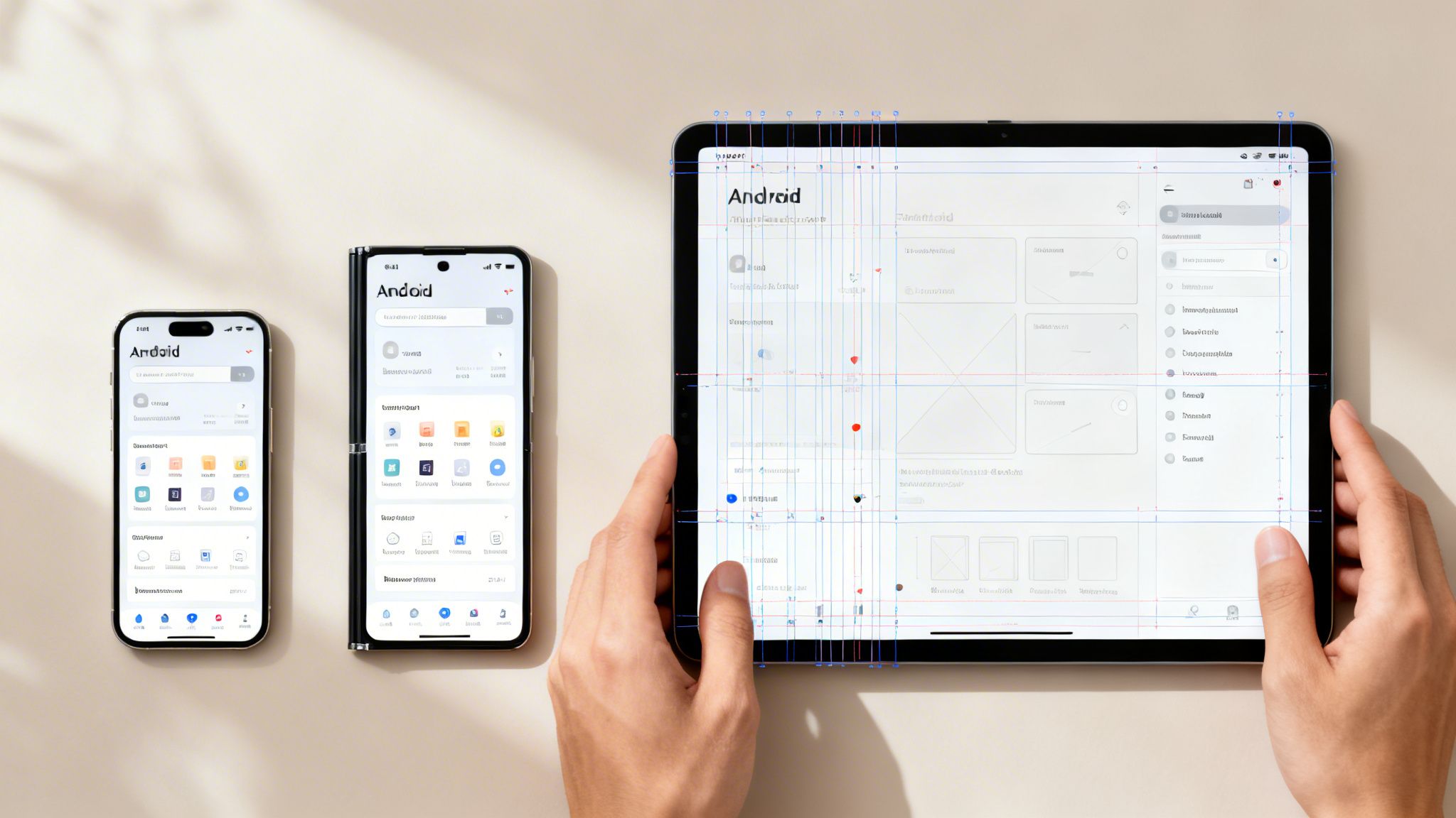
One of Android's biggest strengths—its incredible device diversity—is also one of its biggest design hurdles. An Android user interface design that’s pixel-perfect on a standard phone can easily become a fragmented, unusable mess on a tablet, foldable, or compact device.
This is where responsive and adaptive layouts are no longer a "nice-to-have" but an absolute necessity. Mastering this is not just about clean code; it's a strategic move to capture the entire market. If your app doesn't adapt, you're delivering a suboptimal experience to a significant portion of your potential audience and leaving revenue on the table.
The end goal is a single, flexible UI that feels tailor-made for every screen it appears on.
Core Concepts for Adaptive Android UI
To build layouts that can gracefully adapt and reflow, you need to master a few key concepts. These are not just for developers—designers must also understand them, as they form the foundation for any scalable interface.
- Density-Independent Pixels (dp): In the Android world, we move away from fixed pixels (px). Instead, we use density-independent pixels (dp). A
dpis a flexible unit of measurement that ensures your UI elements maintain a consistent physical size, regardless of the screen's pixel density. - ConstraintLayout: This is the primary tool for creating dynamic, responsive screens. ConstraintLayout is a powerful layout manager that lets you define the position and size of components in relation to one another. It's like creating a web of rules; if one element moves or resizes, everything connected to it adjusts accordingly.
By embracing
dpandConstraintLayout, you make a crucial shift from a rigid, pixel-based mindset to a flexible, relational one. This is non-negotiable for any modern Android user interface design that needs to perform consistently across all devices.
Designing for Window Size Classes
To simplify responsive design, Google introduced window size classes. This system categorizes screen space into three buckets based on available width and height: Compact, Medium, and Expanded.
This approach shifts the focus from designing for specific devices to designing for the available space.
A phone in portrait mode is typically a "Compact" width. A tablet in landscape is "Expanded." By creating layout variations for these classes, you can make smarter UI decisions that enhance usability.
Here's a practical example of how you might adapt your UI:
- Compact: For phone-sized screens, a single-column layout with a bottom navigation bar is often optimal for one-handed use.
- Medium: With more horizontal space, you could replace the bottom bar with a navigation rail on the side, freeing up vertical screen real estate.
- Expanded: On large tablets, a two-pane layout becomes highly effective. This allows you to display a list on one side and its corresponding details on the other, similar to a desktop email client.
This strategy ensures your app doesn’t just awkwardly stretch to fill a larger screen; it intelligently reorganizes itself to be more useful. For a fintech app, this might mean showing a transaction list on the left and the full details of a selected payment on the right. This simple change drastically reduces taps and makes the app far more efficient for power users on tablets.
To see how this fits into a larger strategic framework, you can explore our breakdown of the six steps of the design process.
When you get these principles right, you build an app that feels like it was designed specifically for every device it runs on. That level of polish doesn't just make the app easier to use—it signals quality, builds trust, and ultimately drives growth.
Integrating Accessibility and Localization into Your Design
A truly exceptional Android user interface design is not merely visually appealing—it is usable by everyone, regardless of their language or physical ability. Integrating accessibility (a11y) and localization (l10n) from the outset is not a niche concern; it is a core strategic decision that directly fuels business growth.
For our enterprise and government clients, accessibility is non-negotiable and often a legal and contractual requirement. Beyond compliance, this inclusive approach immediately expands your total addressable market, reduces legal exposure, and builds significant brand trust. Similarly, designing for a global audience through localization is the key to unlocking new revenue streams worldwide.
Practical Steps for Accessible Android UI
At its heart, accessibility means creating interfaces that are easy for people with a wide range of disabilities—visual, motor, auditory, and cognitive—to perceive, operate, and understand. This is a set of practical steps that, when implemented, improve the app for all users.
Here are a few of the most important practices we implement:
- Sufficient Touch Target Sizes: Every interactive element—from buttons and links to small icons—must have a touch target of at least 48×48 dp. This ensures that users with motor impairments, or anyone using the app in a moving vehicle, can tap their target accurately and without frustration.
- Adequate Color Contrast: To serve users with low vision or color blindness, all text and interactive elements must meet Web Content Accessibility Guidelines (WCAG) contrast ratios. As a baseline, normal text requires a contrast ratio of at least 4.5:1 against its background.
- Content Labels for Screen Readers: Blind and low-vision users navigate apps with screen readers like TalkBack, which audibly announce on-screen content. Every interactive element and image must have a descriptive content label. An icon might seem obvious, but without a
contentDescriptionof "Send message," it is invisible to a segment of your user base.
Accessibility is not an overlay or an afterthought; it is a fundamental aspect of quality design. An app that is inaccessible is, by definition, a broken product for a significant portion of the population.
For a deeper look into creating universally usable digital products, you can find valuable insights in our article covering 10 web accessibility best practices.
Designing for a Global Audience with Localization
Localization is far more than simple text translation. It is the process of adapting your entire user interface to fit different cultural contexts, languages, and regional conventions. A properly localized app feels like it was built specifically for its target market, a critical factor for success in global SaaS, e-commerce, and fintech.
Key considerations for localization include:
- Flexible Text Containers: Avoid fixed-width containers for text. Languages like German can be up to 30% longer than English, and your UI must handle this without truncating text or breaking the layout.
- Right-to-Left (RTL) Layout Support: For languages such as Arabic and Hebrew, the entire interface must be mirrored. Your Android user interface design must support this fundamental shift in layout logic, with navigation drawers opening from the right and timelines flowing from right to left.
- Cultural Appropriateness: Icons, colors, and imagery carry significant cultural meaning. A symbol that is intuitive in North America could be confusing or even offensive elsewhere. Thorough research and user testing are essential to ensure your design is culturally sensitive and effective.
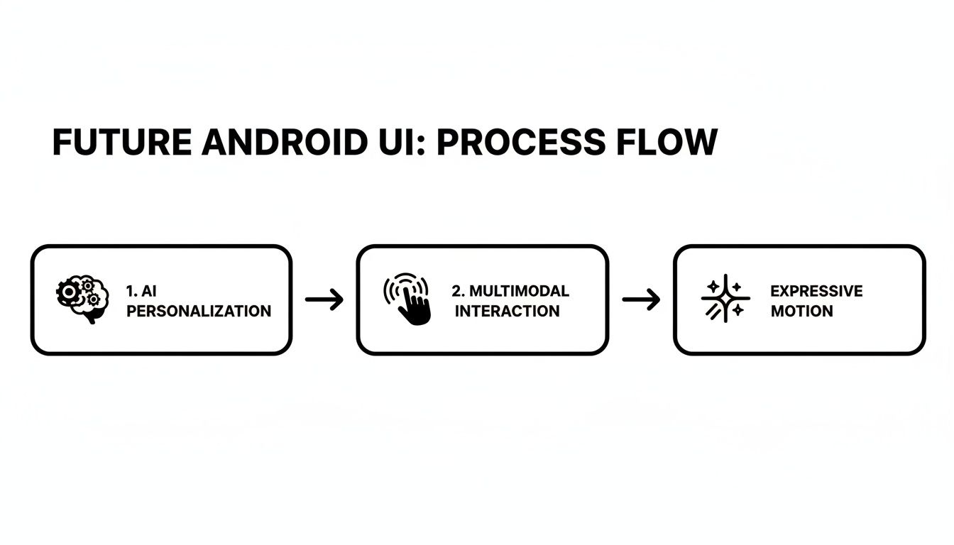
The Future of Interaction in Android UI
The field of Android user interface design is evolving beyond static, handcrafted screens toward interfaces that are intelligent, predictive, and personalized. The future is not just an app that responds to a tap, but an app that anticipates user needs before they are explicitly stated.
For data-intensive companies, particularly in SaaS or finance, this is not a distant concept—it is the next strategic advantage. By integrating technologies like AI-driven personalization and sophisticated motion, you can create a standout user experience. This is how design transcends being a cost center and becomes a driver of business intelligence and bottom-line results.
AI-Driven Personalization and Generative UI
The next major advancement is hyper-personalization, where an app's interface adapts in real-time based on individual usage patterns. This is powered by on-device AI that learns user behaviors to reconfigure layouts, surface relevant information, and simplify complex tasks—all without compromising data privacy by sending information to the cloud.
The benefits are already clear. Projections for 2026 indicate a significant shift toward adaptive UIs, which have been shown to increase task-completion rates by 22% and user engagement by 31%. Since the rollout of Android 13, apps using predictive interfaces have reduced user clicks by up to 18% by accurately anticipating the user's next action. You can get a deeper look at where things are headed in this insightful analysis on future UI trends.
This brings us to Generative UI (GenUI), where AI actively participates in generating interface elements based on user context and role. Consider a financial services application within a large enterprise:
- A junior analyst logs in, and the UI automatically emphasizes daily performance dashboards and reporting tools.
- A portfolio manager opens the same app and sees high-volatility alerts and trade execution controls front and center.
- A compliance officer is presented with a view that prioritizes audit trails and regulatory updates.
This moves beyond simple theming to transform the application into a custom-built tool for each user, increasing their efficiency while reducing information overload. The ROI is clear: faster decisions, fewer errors, and a product that becomes indispensable to your clients' workflows.
The Rise of Multimodal Interactions
Future interfaces will not be confined to touch input. Multimodal interactions—which blend voice, touch, gestures, and even eye-tracking—are set to become standard. The goal is to allow users to interact with an application in the most natural way for their current situation.
Imagine a field technician using an enterprise app to manage assets. With their hands occupied, they could use their voice to file a report ("OK Google, log a coolant leak at pump station 4"), then use a quick tap on their screen to complete a final confirmation checklist.
The power of multimodal design lies in its flexibility. It acknowledges that the user's context is constantly changing and provides the right interaction model for the moment, making technology feel less like a rigid tool and more like a helpful assistant.
For a business, this translates directly to improved operational efficiency and more accurate data collection. When teams in logistics, manufacturing, or healthcare can input information hands-free, it streamlines their workflow and allows them to focus on their primary tasks.
Evolving Motion with Material Expressive
Motion in Android user interface design is also undergoing a major evolution. While Material Design established the foundation of using motion for feedback and guidance, the next step is about adding character and brand expression.
Google's Material Expressive motion system is a prime example. It enables more fluid, on-brand animations that communicate personality. Instead of a generic fade, a retail app might use a playful, bouncy animation when an item is added to the cart to reinforce its brand identity. A fintech app, in contrast, could use a smooth, solid transition to confirm a large transfer, building a feeling of security and trust.
Key principles of expressive motion include:
- Choreography: Ensuring all moving UI elements work together to tell a cohesive story.
- Personalization: The "energy" of an animation can change based on user input, such as a quick swipe triggering a faster transition.
- Brand Alignment: Creating motion that embodies the brand's personality, whether it is playful, elegant, or authoritative.
By investing in these forward-thinking principles, you can build Android apps that are not just functional but genuinely intelligent and a pleasure to use.
A Practical Android UI Design Workflow
Transforming a great idea into a polished Android app requires a deliberate, structured workflow that connects design concepts to a fully functional application. A robust process for your Android user interface design ensures the final product is not just visually appealing but also intuitive, scalable, and performant.
The process begins with prototyping, typically in a tool like Figma. Here, user research and business goals are translated first into low-fidelity wireframes and then into high-fidelity mockups. By building a complete design system—defining all components, colors, and fonts—you create a single source of truth that maintains project consistency.
From Design System to Developer Handoff
A well-documented design system is crucial for a seamless handoff from design to development. It is more than a style guide; it is a live library of reusable components. Each component should have clear specifications for spacing, states (e.g., pressed, disabled), and responsive behavior. When developers can pull exact values and assets, it eliminates guesswork and reduces costly rework.
A comprehensive handoff package should include:
- Component Libraries: Direct access to Figma or Zeplin files where every component is clearly named and organized.
- Interaction Specifications: Detailed notes or prototypes explaining animations, screen transitions, and gesture-based controls.
- Responsive Breakpoints: Clear visual examples showing how layouts must adapt to different window size classes.
This process is becoming more sophisticated, incorporating AI-driven elements and expressive animations from the earliest design stages.
This evolution points toward experiences that are more dynamic and intelligently adapt to user needs. To get a broader view of how this fits into the bigger picture, you can dive into the six steps of the design process.
Testing, Optimization, and Iteration
Once an initial build is available, the work shifts to a critical cycle of testing and refinement. Usability testing with real users is non-negotiable. This is where you uncover friction points and moments of confusion that your internal team is too close to the product to see. Observing new users navigate the app provides the raw, honest feedback needed for improvement.
A design is never truly finished. It’s a continuous loop of building, measuring, and learning. Each iteration brings the product closer to a seamless user experience that drives business goals.
Simultaneously, performance optimization must be a priority. A fast, responsive app is a fundamental part of a good user experience. This involves profiling the app to identify and eliminate performance bottlenecks, ensuring smooth scrolling, and optimizing image loading. A beautiful UI that lags or crashes is a broken UI. By pairing rigorous user testing with a commitment to performance, you deliver a final product that is stable, fast, and a genuine pleasure to use.
Common Questions in Android UI Design
As you delve deeper into Android user interface design, you will encounter common questions and technical challenges. The technology and best practices are constantly evolving. Here are straightforward answers to some of the most frequent queries our team addresses.
What Is the Difference Between MVI and MVVM?
This is a common architectural debate in the Android community. Both Model-View-Intent (MVI) and Model-View-ViewModel (MVVM) are patterns designed for a clean separation of concerns, but they manage state and user input differently.
MVVM, introduced by Microsoft in 2005, typically involves a ViewModel exposing multiple data streams (often using LiveData or StateFlow) to the View. The View observes these streams and updates itself accordingly.
MVI, in contrast, enforces a stricter, unidirectional data flow, creating a predictable loop.
Key distinctions of MVI include:
- Single Immutable State: The screen has only one state object. Any change produces a new state object, which prevents unpredictable side effects and simplifies debugging.
- Intents for Actions: Every user action (a tap, swipe, or text input) is encapsulated as an "Intent" (distinct from Android's system
Intentclass) and sent to the ViewModel. - Reducer Function: A pure function forms the core logic. It takes the current state and the user's Intent to produce the new state, following the formula:
(Old State + Intent) -> New State.
While many modern Android apps use a hybrid approach, a pure MVI implementation offers a disciplined cycle that can make application state significantly easier to manage and debug.
Why Is Text Truncation a Problem in Android UI?
Text that is cut off and replaced by an ellipsis (…) may seem like a minor cosmetic issue, but it is a major obstacle to usability and accessibility. This often occurs when a user increases their system font size for better readability, and the app's static text containers can no longer accommodate the content.
If there’s an ellipsis, but no way to show the truncated text, it is not accessible. This is a core principle even highlighted in Material Design's guidelines.
The fundamental problem is that truncation hides critical information. Imagine a button labeled "Confirm Transac…"—is the user confirming a transaction, a transfer, or a translation? This ambiguity adds cognitive friction and can render an app unusable for individuals who rely on larger text sizes.
The correct solution is to build responsive layouts that allow text to wrap onto new lines. If truncation is absolutely unavoidable, you must provide a mechanism for the user to view the full content, such as a tap-to-expand button or a tooltip on long-press.
Summary and Next Steps
Mastering Android user interface design is a strategic imperative for any business aiming to succeed in the mobile-first landscape. It requires a deep understanding of Material Design, a commitment to responsive layouts, and a non-negotiable focus on accessibility and localization. The future of UI is intelligent, personalized, and multimodal, offering unprecedented opportunities to create experiences that drive engagement and deliver significant business value.
To apply these principles effectively, your team should:
- Audit Your Current UI: Evaluate your Android app against Material Design guidelines, accessibility standards, and responsive best practices.
- Establish a Design System: If you don't have one, begin documenting your components, theming, and motion to ensure consistency and accelerate development.
- Prioritize User Testing: Implement a continuous feedback loop where real users test new features to identify and eliminate friction points.
- Explore Advanced Interactions: Begin planning for how AI-driven personalization and multimodal inputs can enhance your app's core functionality and provide a competitive edge.
Building a flawless Android UI demands expertise in strategy, engineering, and user-centric principles. Group107 offers dedicated offshore teams of UI/UX specialists and developers who design and build scalable, accessible, and high-performing Android applications that fuel business growth. Learn how we can accelerate your product development.


