Making a website accessible means implementing a strategic set of practices to ensure that everyone, including users with disabilities, can navigate and interact with your digital content. This involves everything from ensuring full keyboard navigation and screen reader compatibility with well-structured HTML and ARIA, to optimizing color contrast and providing alternative text for all images.
Why Web Accessibility Is a Strategic Imperative

Web accessibility is no longer a niche compliance task—it is a core pillar of modern business strategy. For enterprise, SaaS, and fintech companies, building inclusive digital platforms is a direct path to market expansion, enhanced brand loyalty, and tangible revenue growth. Ignoring accessibility means intentionally excluding a significant segment of potential customers.
The financial cost of an inaccessible website is staggering. Consumer-facing businesses lose an estimated $6.9 billion annually as users with disabilities—a global market of 1.3 billion people—move to competitors who prioritize an inclusive experience. These are not just statistics; they represent a fundamental business reality. Inaccessibility equals lost revenue.
The True Cost of Inaccessibility
Beyond the direct impact on revenue, poor accessibility erodes brand reputation and creates significant legal risk. As global regulations like the EU Accessibility Act become more stringent, a proactive approach is essential for future-proofing your business. This is especially true in sectors like finance, where trust is paramount. An inaccessible platform sends a clear message that you do not value all your customers’ needs, severely damaging credibility.
An inaccessible website is the digital equivalent of a locked storefront. It tells a significant portion of your potential customers that their business isn’t welcome, pushing them directly to competitors who have invested in an open door.
The benefits of building an accessible website extend far beyond risk mitigation. Inclusive design principles create a better, more intuitive user experience for everyone. Furthermore, many accessibility practices, such as proper heading structures and descriptive alt text, directly improve your SEO, boosting your site’s visibility and organic reach.
A Roadmap for Inclusive Growth
This guide provides an actionable roadmap for your product, engineering, and leadership teams. We will move beyond theory and into practical implementation, covering everything from foundational code to robust testing and remediation workflows.
By adopting these strategies, you can transform accessibility from a technical task into a powerful strategic advantage. This isn’t just about compliance; it’s about leading your market and achieving sustainable growth. For companies in specialized fields, understanding the nuances of accessible fintech software development services is a critical first step.
The core business benefits of a commitment to web accessibility include:
- Expanded Market Reach: Access the $6.9 trillion in disposable income held by people with disabilities and their networks.
- Enhanced Brand Reputation: Demonstrate a commitment to inclusivity and social responsibility, building powerful brand loyalty.
- Improved SEO Performance: Leverage accessibility best practices that align with search engine optimization standards.
- Reduced Legal Risk: Proactively comply with evolving global standards and avoid costly, brand-damaging lawsuits.
- Superior User Experience: Create flexible and intuitive platforms that benefit your entire customer base.
Building an Accessible Foundation with Semantic HTML and ARIA

To build an accessible website, you must start with the code. The structural integrity of your site depends on clean, semantic HTML. Think of it as the architectural blueprint that assistive technologies, like screen readers, use to interpret your content. Without this solid foundation, even the most visually appealing interface becomes an unnavigable maze for many users.
Semantic HTML5 elements like <nav>, <main>, and <header> act as digital signposts, creating an instant, machine-readable map of your page. A screen reader can announce “main content,” allowing a user to bypass repetitive navigation links. This is a fundamental requirement for a usable experience.
Leveraging Semantic HTML for Clarity
Using generic <div> and <span> tags for everything forces you to add extra attributes to define their purpose, increasing complexity and the potential for error. Native HTML elements, however, have accessibility built-in.
Consider the <button> element. It is inherently focusable, responds to both the Enter and Space keys, and is immediately recognized by screen readers. Replicating this behavior with a <div> requires custom JavaScript and ARIA attributes—a process prone to bugs.
Prioritize these essential semantic tags:
<header>: For introductory content, such as your logo, search bar, and top-level navigation.<nav>: Specifically for major navigation blocks to help users orient themselves.<main>: Identifies the primary content of the page. There should only be one<main>element per page.<article>: For self-contained content like a blog post, news story, or product listing.<section>: To group related content thematically. Every<section>should have a heading for context.<footer>: For content at the bottom of the page, like copyright information, author details, or secondary links.
When you use semantic HTML correctly, you provide assistive technologies with a clear, logical content structure. This is the first and most critical step in building a truly accessible website. Attempting to patch poor structure with ARIA later is a recipe for a brittle and frustrating user experience.
Introducing ARIA for Complex Components
While semantic HTML is your primary tool, it cannot always describe the state and function of complex, dynamic components. This is where ARIA (Accessible Rich Internet Applications) becomes essential.
ARIA is a set of attributes added to HTML elements to provide assistive technologies with additional context. It is crucial for modern web applications, especially in fintech and enterprise SaaS platforms that use custom components like dynamic dashboards, sortable data tables, or multi-step wizards. ARIA communicates information native HTML cannot, such as whether a custom dropdown is expanded or collapsed.
However, the most important rule of ARIA is: no ARIA is better than bad ARIA. Incorrect implementation can create more confusion than it solves. For example, adding role="button" to a native <button> element is redundant. Use ARIA only when a native HTML element is insufficient.
For complex UI challenges, a deep understanding of web accessibility best practices is non-negotiable.
Practical ARIA Implementation Examples
Consider a custom-built accordion menu. A <div> used as the clickable header provides no semantic information to a screen reader. By adding a few ARIA attributes, we can make its function perfectly clear.
To enhance this interactive element correctly:
- Define the Role: Add
role="button"to the clickable header to inform assistive technology that it functions like a button. - Communicate the State: Use
aria-expanded="false"to indicate the content panel is initially closed. Your JavaScript should toggle this toaria-expanded="true"upon user interaction. - Create a Relationship: Assign the content panel a unique
id(e.g.,id="panel-1") and addaria-controls="panel-1"to the button. This explicitly links the control to the content it manages.
This approach transforms a generic <div> into a fully interactive and understandable component for all users. This level of detail is fundamental when learning how to make a website accessible at the code level.
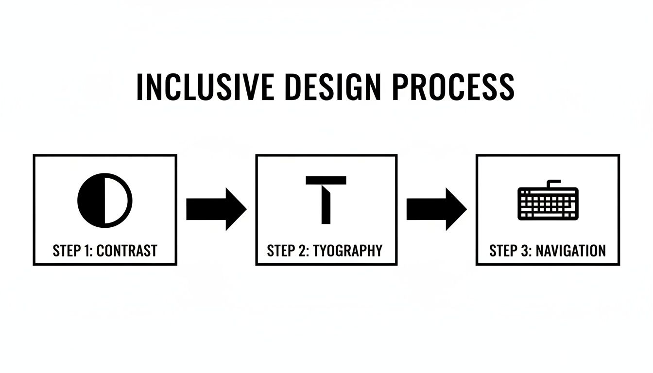
Mastering Inclusive Design and User Experience
With a solid codebase, the next focus is the user-facing experience. An inclusive product is not just about semantic HTML; it’s about thoughtful design choices that make your site intuitive for everyone. This is where accessibility becomes a tangible part of the user journey.
An accessible design is simply a better design. Principles like clear contrast, readable fonts, and logical navigation improve the experience for your entire audience, creating a significant differentiator in competitive markets like fintech and SaaS.
The Critical Role of Color and Contrast
One of the most common—and easily fixable—accessibility failures is poor color contrast. When text and its background are too similar, users with low vision or color blindness cannot read your content. WCAG 2.2 AA standards provide a clear target.
The standard text must have a contrast ratio of at least 4.5:1 against its background. For larger text (18pt normal or 14pt bold), the requirement is a more lenient 3:1 ratio.
These ratios are based on research into human vision. You can easily verify your color combinations with tools like the WebAIM Contrast Checker or the developer tools in your browser.
The WebAIM Million report revealed that a staggering 86% of the top million homepages failed due to low contrast text. Mastering fundamentals like contrast, descriptive alt text, and proper heading structure will place you far ahead of the curve.
Core WCAG 2.2 AA Design Checklist
This checklist covers common design-related criteria and provides a solid starting point for any product design review.
| WCAG Guideline | Success Criterion | What It Means | Actionable Tip |
|---|---|---|---|
| Perceivable | 1.4.3 Contrast (Minimum) | Ensure text has sufficient contrast against its background. | Use a contrast checker. Aim for 4.5:1 for normal text and 3:1 for large text. |
| Perceivable | 1.4.1 Use of Color | Do not rely on color alone to convey information. | Supplement color cues with icons, text labels, or patterns. |
| Operable | 2.4.7 Focus Visible | A clear visual indicator must show which interactive element has keyboard focus. | Do not disable the default :focus outline unless replacing it with a more prominent one. |
| Understandable | 3.2.4 Consistent Identification | Components with the same function across pages should be identified consistently. | Use the same icon and label for “Search” or “My Account” on every page. |
| Perceivable | 1.4.4 Resize Text | Text should be resizable up to 200% without breaking the layout or losing content. | Use relative units like rem for font sizes and container widths. |
Nailing these five criteria will resolve a significant percentage of the most common design-related accessibility issues.
Designing for Keyboard-Only Navigation
True accessibility means a user can operate your entire site without a mouse. This is essential for users with motor disabilities and a benefit for power users who prefer keyboard shortcuts.
Every interactive element—buttons, links, form fields—must be reachable and operable using the Tab key. The navigation order must also follow the logical visual flow of the page.
To achieve this, your design must include:
- A Visible Focus Indicator: When a user tabs to an element, a clear visual cue—such as an outline or background color change—must indicate their location. Disabling the browser’s default focus outline renders the site unusable for keyboard navigators.
- Logical Tab Order: The tabbing sequence must be predictable and follow the visual layout.
- “Skip to Main Content” Links: For pages with extensive navigation, a “skip link” is crucial. As the first focusable item, it allows keyboard users to bypass header links and jump directly to the primary content.
For a deeper analysis of these strategies, our comprehensive guide on web accessibility best practices offers more actionable steps.
Typography and Layout for Readability
Inclusive design also involves choosing fonts and layouts that enhance readability.
Follow these best practices:
- Use Scalable Text: Use relative units like
remoremfor font sizes to respect user browser settings and allow for zooming without breaking the layout. - Choose Readable Typefaces: Select fonts with clear, distinct letterforms. Avoid overly decorative or thin fonts that can be difficult for users with dyslexia or vision impairments to read.
- Ensure Ample Line Spacing: A line height of approximately 1.5 times the font size improves reading comprehension by preventing text from appearing dense.
- Avoid Justified Text: Justified text can create inconsistent spacing between words, making it difficult to read. Left-aligned text provides a more consistent and readable flow.
Implementing a Robust Accessibility Testing Workflow
Building accessible features is only half the battle. You must validate that they work for real people. An accessibility testing workflow is a critical framework that integrates quality into your development lifecycle from the beginning.
For enterprise and fintech companies, a structured, repeatable testing process is the only way to maintain compliance and deliver a consistently usable product. This requires a hybrid model that combines the speed of automated testing with the nuanced insights of manual evaluation.
The Role and Limits of Automated Testing
Automated accessibility tools like axe, WAVE, and Lighthouse are excellent for establishing a baseline and catching obvious WCAG violations. They can be integrated into your CI/CD pipeline to provide developers with instant feedback.
Automation excels at identifying programmatic errors, such as:
- Missing
alttext on images - Insufficient color contrast
- Unlinked form labels
- Incorrect ARIA attributes
However, automated tools can only detect around 30-40% of all accessibility issues. They cannot determine if alt text is meaningful, if the keyboard navigation order is logical, or if the overall user experience is coherent. Automation flags what is programmatically incorrect, not what is unusable. Relying solely on these tools creates a false sense of security.
The Indispensable Value of Manual Testing
Manual testing reveals the true user experience. It involves interacting with your website using the same assistive technologies your users do. This process uncovers the critical, experience-based issues that determine whether your site is genuinely usable.
This process ensures your design pillars—contrast, typography, and navigation—are solid enough to support an inclusive experience.
A robust manual testing checklist is essential for your QA process. Key validation steps include:
- Keyboard-Only Navigation: Can you access and operate every interactive element using only the keyboard? Is the focus indicator always visible? Is the tab order logical?
- Screen Reader Testing: Using tools like NVDA (Windows) or VoiceOver (macOS), is all content read correctly and logically? Do interactive elements announce their name, role, and state? Are complex widgets like date pickers operable without sight?
- Cognitive Walkthroughs: Are key user flows simple and direct? Is the layout consistent across pages? Are there distracting, auto-playing animations that cannot be stopped?
- Content Scaling: When the browser is zoomed to 200%, does the layout reflow correctly without horizontal scrolling or overlapping text?
Creating Compliance Documentation: The VPAT
For enterprise or government contracts, proving accessibility is often a requirement. A Voluntary Product Accessibility Template (VPAT) is the standard document for reporting how your product conforms to accessibility standards like Section 508 and WCAG.
Creating a VPAT involves auditing your product against each criterion and documenting its conformance level (“Supports,” “Partially Supports,” or “Does Not Support”). The resulting Accessibility Conformance Report (ACR) provides the transparency procurement officers require. To understand the legal context, refer to our guide on ADA website compliance requirements.
An accurate VPAT, backed by a rigorous testing workflow, is a powerful sales tool and a clear signal of your commitment to inclusivity.
Turning Your Audit into an Actionable Remediation Plan
An accessibility audit report is the starting point, not the destination. The true value lies in translating its findings into a structured, actionable remediation plan. Without a clear framework, audit results become technical debt, leaving your organization exposed to legal risk.
Prioritizing Based on Impact and Severity
The first step is to triage issues. Not all accessibility bugs are equal. A successful plan balances user impact against development effort. The most effective approach is to categorize each issue by severity level.
Your remediation strategy should answer one question: “What will deliver the most meaningful improvement for our users with our current resources?”
We recommend a prioritization matrix with a clear severity scale:
- Blocker: Prevents a user from completing a core task (e.g., inability to submit a payment form with a screen reader). These require immediate attention.
- Critical: Creates significant barriers and frustration, even if a workaround exists (e.g., a keyboard-inoperable main navigation menu).
- Serious: Degrades the user experience but does not completely block a user journey (e.g., poor color contrast making text difficult to read).
- Moderate: Minor issues that cause inconvenience but do not break the experience (e.g., redundant link text like “click here”).
The goal of a remediation plan is not to fix everything at once. It’s to create a phased approach that addresses the highest-impact issues first, delivering incremental value to users and steadily reducing legal exposure with each development sprint.
Translating Findings into Developer-Ready Tickets
An audit finding like “SC 1.3.1 Info and Relationships” is not actionable for a developer. Each issue must be translated into a detailed ticket in your project management tool, whether it’s Jira or Asana.
A high-quality accessibility ticket must include:
- A Clear, User-Centric Title: Instead of “WCAG 2.4.7 Violation,” use “Keyboard Focus Indicator Missing on Login Button.“
- The User Impact: Explain why it’s a problem (e.g., “Keyboard users cannot tell which element is active, making it difficult to log in.”).
- Specific Location: Pinpoint the URL, component, and part of the interface.
- Steps to Reproduce: Provide a clear, numbered list of steps to replicate the bug.
- Suggested Remediation: Offer a clear solution, including code snippets and a link to the relevant WCAG success criterion.
- Acceptance Criteria: Define what “done” looks like (e.g., “When tabbing, the Login button must have a visible 2px blue outline.”).
This level of detail removes ambiguity and empowers engineering teams to implement fixes correctly the first time.
Integrating Accessibility into Agile Workflows
To ensure long-term success, accessibility must be integrated into your existing agile workflows. Stop treating it as a separate project. Remediation tickets should be added to your product backlog, prioritized, and assigned story points alongside new features and other bug fixes.
By making accessibility a non-negotiable part of your team’s Definition of Done and implementing ongoing monitoring, you can prevent regression and build a sustainable culture of inclusivity.
Common Questions About Making a Website Accessible
As teams commit to accessibility, several practical questions consistently arise. Here are answers to the most common ones.
What Is the Difference Between WCAG A, AA, and AAA?
The Web Content Accessibility Guidelines (WCAG) have three levels of conformance:
- Level A: The baseline, addressing the most severe barriers that could completely block a user. Failing to meet Level A means your product is unusable for some.
- Level AA: The industry standard and the level cited in most accessibility legislation. It ensures a robust and usable experience. WCAG 2.1 or 2.2 Level AA is the target for most enterprise, SaaS, and fintech platforms.
- Level AAA: The highest standard, often reserved for specialized accessibility services or government websites. Achieving full AAA compliance across a complex commercial platform is typically impractical.
How Much Does It Cost to Make a Website Accessible?
The cost depends on when and how you approach accessibility.
Integrating accessibility from the start of a new project is the most cost-effective approach. For an existing platform, the cost depends on the audit findings. Remediation can range from a minor effort to a significant project.
However, the key insight is this: proactive accessibility is always more cost-effective than reactive fixes, emergency sprints, and legal fees.
Are Accessibility Overlay Widgets a Compliant Solution?
Accessibility overlay widgets promise an instant, AI-powered fix by applying a script to your site.
The expert consensus is clear: accessibility overlays are not a genuine or legally defensible solution. They fail to address underlying code issues, often conflict with users’ own assistive technologies, and have been cited in lawsuits.
There are no shortcuts to real accessibility. It requires fixing your code and design, not applying a superficial patch.
What Is the Most Important First Step?
If you are starting from scratch, the single most important action is to commission a comprehensive accessibility audit.
You cannot fix what you do not know is broken. A thorough audit combines automated scanning with expert manual testing to provide a definitive baseline, a prioritized list of risks, and a concrete roadmap for remediation. It transforms the abstract goal of “being accessible” into an actionable plan.
At Group107, we specialize in translating complex accessibility requirements into compliant, user-friendly digital experiences. Our experts guide you through every step, from initial audits to full-scale remediation and ongoing support. Learn how we can help you build an inclusive platform.